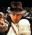
Hey guys, thought I'd stick up one of my favourite Angel covers from my recent run, cos I KNOW I can show IDW stuff. I'll stick the pencils, inks and colours up so ye can see the transition from dodgy to dodgier. Fairly warned be thee, says I
Class. I prefer it in black and white to be honest. Nothing wrong with the colours mind you, just seems more dramatic without. That cover with the playing card was my favourite. Dec
Fair enough, but it's amazing how far a good concept can go when it comes to covers. You could draw the hell out of it and it still wouldn't matter, the effect is the same.


6 comments:
Yay! Good work there MOOOOOOOney. Cool pencils. See? Now you're getting it.
Class. I prefer it in black and white to be honest. Nothing wrong with the colours mind you, just seems more dramatic without.
That cover with the playing card was my favourite.
Dec
Yeah, lotta people saying that... I still prefer this one though. TRhink the playing card was just a good concept more than a great drawing really.
Fair enough, but it's amazing how far a good concept can go when it comes to covers. You could draw the hell out of it and it still wouldn't matter, the effect is the same.
Nice one Sham. Good to see you on the oul blog. Post up some more stuff
...what's a 'sham'?
Post a Comment